
New NEOCH Look: Behind the Scenes
Hello NEOCH friends and community!
My name is Kathryn Boor (She/They), and I am the Communications Coordinator at NEOCH. I overlook our social media, newsletters, website, blog, flyers, and any other projects that I can get my hands on to support our NEOCH team. Since joining in 2023, I have been excited to refresh our brand and website. With a background in graphic design and marketing, I was enthusiastic about applying my branding skills to our outdated website.
I wanted to give you a behind-the-scenes look at how I changed our website since there has been a rise in the use of generative AI.
One of the first things you do when cleaning up a website or working on a website is you look at your site map. A site map is how you organize your pages. It is how you decide what content goes in what buckets. This looks like a really clean navigation bar (the top bar of a website) and drop-down options that make sense. I looked at our navigation bar and started looking at what content could be paired together to make one strong web page rather than many smaller pages.
Once I am happy with how the content is organized, I lay out the pages. You have to think of content hierarchy. This is how you get big headers and smaller paragraph text. If I do it right, you, the reader, can skim the page and find what you need quickly. But if you would like, you can pause and take time to read the content. I have to keep hierarchy in mind for accessibility, and the coding tells Google the BIG text is important. This helps with SEO (Search Engine Optimization), meaning when someone Googles/searches for something, our webpages will show up first.
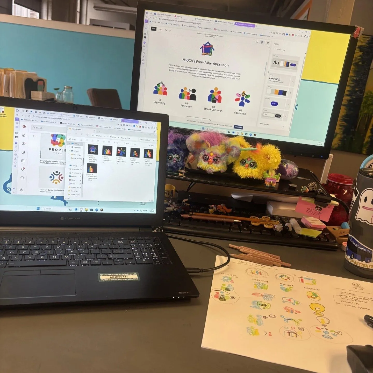
You can also see my cluttered desk. I love pops of color and you can see a small collection of my Furby babies. Other than my cluttered desk, you can see my hand-drawn icons being digitized on the laptop screen.
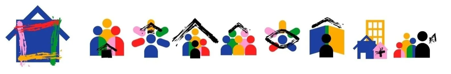
Now is FINALLY the fun part, and I get to design the pages. I chose our branded colors (from the rebrand I did in 2024) and photos that represent our team. I also designed our icons from scratch. I am a very physical person, so I had a large sheet of paper next to me to draw the icons, jot down important thoughts, and organize webpages. I drew all the icons by hand before pulling them into a design program and making custom icons! (You can see them mainly on the home page and our Four-Pillar Approach page.)
Finally, it is time for me to fine-tune the web pages. I go between laptop and mobile view to make sure that everything aligns well and is still easy to read and navigate. This is also the time for me to test every button, form, and link to make sure they are properly linked. This process is very tedious, so I listen to a lot of podcasts and try to get other eyes on my work to double-check.
I am really proud of how the website came out! It is important for websites to be clean and have good hierarchy. This makes content more accessible for those who are visually impaired to use text-to-speech, those who struggle to navigate websites, and those who want to find information quickly. It is also great to have a nice-looking website. The colors are bright and eye-catching. The icons communicate our values and mission, and everything pulls together really well.
More changes are coming to the website, but I wanted to share the human approach behind our website change! There’s been an uptick in using AI for everything in our life making everything feel the same as one another. AI is not sustainable for our communities, environment, or minds. This update took weeks for me and will never be finished, but it is a labor of love, paved with human passion and intention.
Thank you for supporting NEOCH and happy 2026!